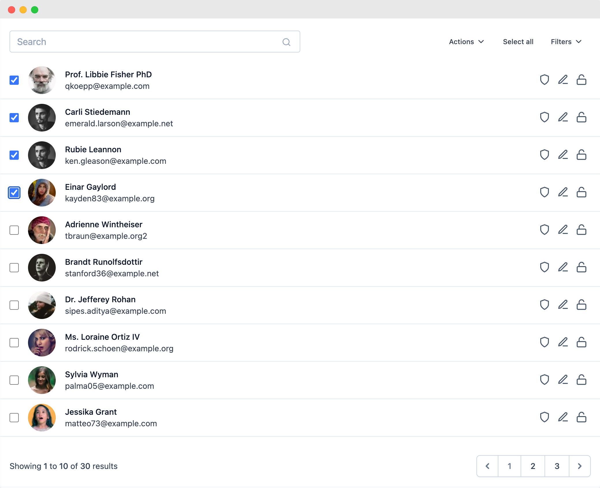
List view
This view creates a dynamic list view with filters, pagination and, a search input, it comes with a default list item component ready to use with some basic data and, it also can use a customized list item component if it is needed.

Creating a new list view
php artisan make:list-view ExampleListView
With this artisan command an ExampleListView.php file will be created inside the app/Http/Livewire directory, with this class you can customize the behavior of the list view.
Defining initial data
The ListView class needs a model class to get the initial data to be displayed on the table, you can define it in the $model property.
use App\User;

protected $model = User::class;
If you need an specific query as initial data you can define a repository method returning an Eloquent query with the initial data to be displayed on the list view, it is important to return the query, not the data collection.
use App\User;
use Illuminate\Database\Eloquent\Builder;

/**
 * Sets a initial query with the data to fill the table
 *
 * @return Builder Eloquent query
 */
public function repository(): Builder
{
    return User::query();
}
If you define this method, the $model property is not needed anymore.
Defining list item data
The list view uses blade components for showing every item in the list, that blade component gets its props defining a data() method, it returns an array and every item of this array will be passes as a prop to the blade component.
Using the default list item

The list view uses a default list item component for showing some basic data, the array returned by the data() method should have the avatar, title, and subtitle of the list item.
public function data($model)
{
    return [
        'avatar' => $model->avatar,
        'title' => $mode->name,
        'subtitle' => $model->email,
    ];
}
These are the fields by default but you can add more if you want to customize your list item component.
Creating a customized list item
The list view uses its own blade component by default with some data, however, you can create your own list item component and use as much data as you need, you just need to set a public property with the name of your custom component. If you need different properties in your component just return them in the data() method.
public $itemComponent = 'components.my-custom-list-item-component';

public function data($model)
{
    return [
      // ... all the component's properties
    ];
}
All the data returned in the data() method will be received as a prop in your blade component along with these other default props that you can use based on your needs.
| Name | Description | Type | Value |
|---|---|---|---|
| model | Model instance for this card | ||
| actions | Actions defined in this view class | Array |
With all this data you can build your own card component as you need, remember to include an actions component.
<x-lv-actions :actions="$actions" :model="$model" />
<!-- Or -->
<x-lv-actions.drop-down :actions="$actions" :model="$model" />
Sorting data
You can add an option to sort the items on the grid view by an specific field defining a sortableBy method with an array of the fields to sort by, as the grid view desn't have headers, a Sort by button will be displayed with a drop down with all the fields defined in this method.
public function sortableBy()
{
    return [
        'Name' => 'name',
        'Email' => 'email'
    ];
}
More features
In addition, this view supports more features like: Searching data, Pagination, Filters, Actions, and UI components